Who moved my comments?
If you’ve been following what Nonstop Honolulu has been doing for the past couple days, I’m sure you’ve clicked around the site, browsed through our galleries and read through some of our content. Like any Web site, content presentation is important to us, and the way users interact with that content is becoming even more important, especially for a savvy, web-centric audience such as yourself.
Being a digital designer, and Creative Director of Nonstop Honolulu, it’s my responsibility to make this content look good, feel good and most importantly work good. That being said, in our initial stages of design and development, I put some thought into how content would flow, how the reader would skim and comment, where to place share buttons and widgets, and what you see today is a preliminary result of those thoughts.
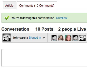
If you’re used to any other Web site or blog, you know that comments are typically below the main story content. There are a number of reasons why; some are valid, others debatable, but more recently, users are starting to pay more attention to user-generated content such as comments, and in some cases, these comments can make or break the integrity of a great story. I’ve witnessed this firsthand as Digital Supervisor of Design at The Honolulu Advertiser, getting lectured by readers who were probably a little too concerned about what others were saying and the quality of conversation going on.
In the case of Nonstop, I decided to try something a little different. The base theme that Nonstop was built on came packaged with standard category pages, headers, footers and an article page. The plan was to heavily customize the site and continue to build and improve after launch. The files that control story content offered two forms of comment layout: one, your traditional, below-the-story comments area; and two, a tabbed commenting configuration which offered separation between content and user-generated conversation. With the experience I’ve had from the past, I felt that there would be some value in launching with a tabbed content format and if there was huge opposition to the idea, I could easily change it back to a bottom comment configuration.
While realizing this could disjoint page flow that users are accustomed to, I thought it was worth the risk to try something different. We’re in the business of breaking the mold and creating an experience that users look forward to when visiting Nonstop Honolulu.
Majority of the feedback that we’ve received on the site has been positive, but we’ve also got some very honest creative criticism about our name, logo and more, which Diane and I appreciate, and need, to ensure that people care about our efforts. It was not until today during pre-show of the Bytemarks Cafe radio show, that Ryan Ozawa mention the tabbed comment configuration and his thoughts on it.
For Ryan, page flow was greatly affected and the absence of those friendly little fields made him feel like moving on to a new blog post. What do you think? Can’t stand having to click back to the content tab? Prefer content separated from comments? Let us know what you think! There’s no good, bad or ugly answer, so fire away!