Design breakdown: The New “Five-0”
With an onslaught of blog posts and mentions of last night’s premiere of the new “Hawaii Five-0”, you’re bound to find multiple reviews, story dissections and character breakdowns, which is cool, but I’m really no critic, so I’ll leave the reviewing up to Nonstop’s Cat Toth.
As my buddy and fellow Hawaii blogger Andreas Arvman said, “How could you have a blog in Hawai’i and not write about the new “Hawaii Five-0″ series?”, so here I am — but I’m taking a different approach. Let’s discuss the design of the new “Five-0”.
First, let’s have a look at the classic opening theme:
Classic frame #1:
Designers — can you name that font? I can’t! Looks like some kind of dated sans-serif. Some say it’s close to “PF Encore Sans Pro”. After a search, I couldn’t find the answer. Maybe we can figure out who the original designer was and interview them?
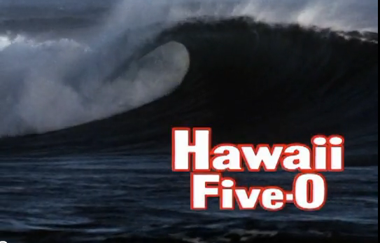
The red outline on white text helps to make it pop. It’s a little harsh for my liking, but, I’m sure for 1968, this was pretty rockin’. How would you update the opening scene of a classic? Let’s see what CBS thought it should look like.
New frame #1: